General
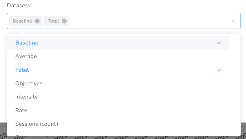
| Dataset | Description |
| Baseline | Expected behavior of data, used for comparative purposes |
| Average | Average of values through a day, week, month, or year |
| Total | The total value of data during a day, week, month, or year |
| Rate | Occurrence of an event during a unit of time |
| Count | The total value of data collected |
| Session count | Count of sessions during a day, week, month, or year |
Interval, the interval could be one of these: Daily, Weekly, Monthly, Quarterly, Yearly.
X-Axis
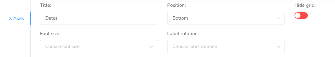
- Title – Here you define the title that will be displayed at the base of this axis.
- Position – You can select whether you want to see it at the top or at the bottom.
- Hide grid – If necessary, you can hide the grid.
- Font size – You can, if necessary, increase the size of the dates’ font.
- Label rotation – You can choose between a horizontal (0 degrees) or vertical (90 degrees) views.
Y-Axis
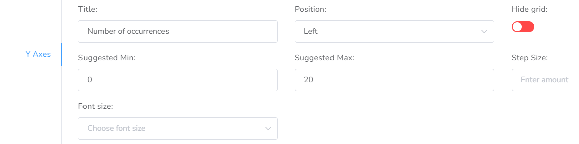
- Title – Here you define the title that will be displayed at the base of this axis.
- Position – You can select whether you want to view it on the right or left side.
- Hide grid – If desired, you can hide the grid.
- Suggested min – Typically, the suggested minimum is zero.
- Suggested max – The suggested maximum always varies depending on the data collection you have configured. In case the values are higher than the suggested maximum, the graph will auto-adjust to display them.
- Step size – This varies depending on the values and how much you want the increment to be displayed. If you leave it blank, the system will automatically adjust it.
- Font size – You can, if necessary, increase the size of the values’ font.
Dataset Visual Configuration
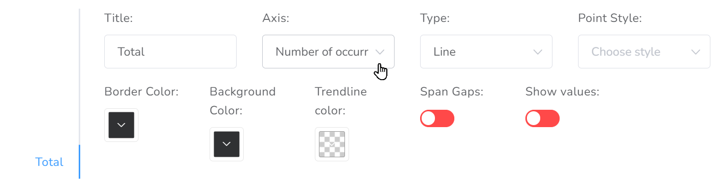
- Title – Here you define the title that will be displayed at the list of the datasets.
- Axis – Here you define the axis it will be displayed, typically the Y-axis.
- Type – You can select whether you want to show it as lines or bars.
- Point Style – You can choose the style of the data points: circle, triangle, star.
- Border color – Here you define the color of the line connecting the points.
- Background color – Here you define the color of the dots/bars that show the value of the collected data.
- Trend line color – Here you define the color of the trend line.
- Span Gaps – In case there is a week without data and a gap is shown in the graph, you can select to join the points and skip these spaces.
- Show values – If you wish, you can display the values of the collected data.