A chart is a highly effective way of presenting information, since it tends to highlight the data behavior and trends better than tables. Any study or investigation that requires recollecting and managing data should include charts for a better analysis, interpretation, and visualization of the results.
Office Puzzle offers the possibility to create charts with a powerful and fully customizable system, while also providing a friendly and usable interface.
Why use the charts:
- Provides immediate access to the behavioral log.
- Having real-time info about the variations of data incentives exploration.
- Offers assistance when judging.
- Promotes independent judgment and interpretation.
- Effective source of feedback.
Filters

You can define what exactly you would like to display, this includes but is not limited to:
- Range, start and end date, only available data will be displayed in the chart.
- Interval, the interval could be one of these: Daily, Weekly, Monthly, Quarterly, Yearly.
- Aspect Ratio, depending on your screen or where you are looking to use the chart, you can choose an aspect ratio that accommodates your needs.
Datasets
If configured in the Service Plan, you could add as many datasets as are available.
| Dataset | Description |
| Baseline | Expected behavior of data, used for comparative purposes |
| Average | Average of values through a day, week, month, or year |
| Total | The total value of data during a day, week, month, or year |
| Rate | Occurrence of an event during a unit of time |
| Count | The total value of data collected |
| Session count | Count of sessions during a day, week, month, or year |
Graph
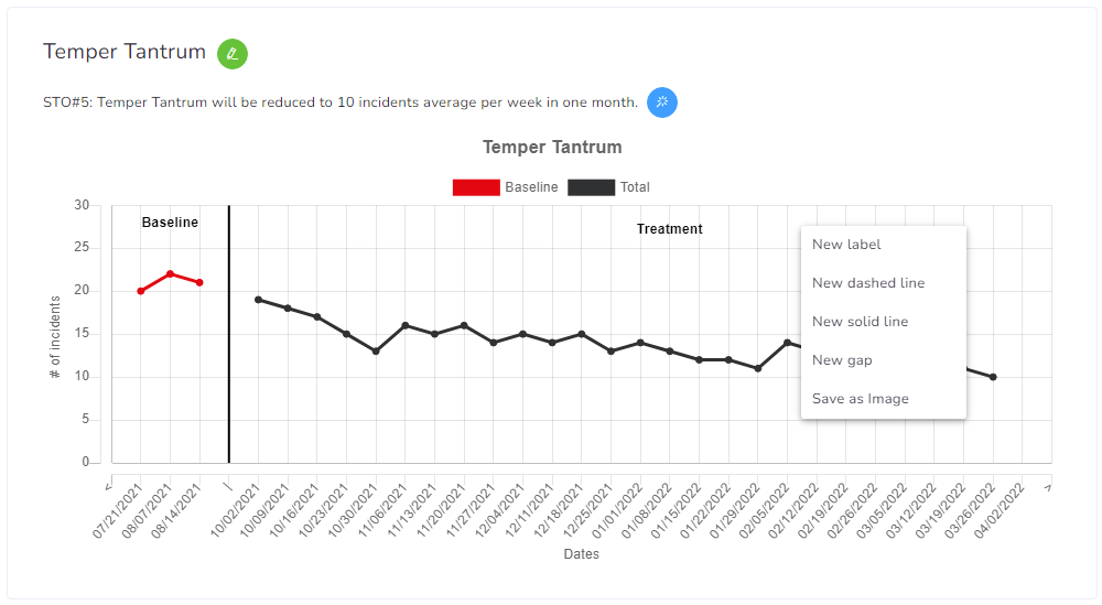
All charts will show their name at the top, followed by the current Objective (if available).
You can quickly edit the Service Plan element using the green pencil button right next to the name.
You can quickly validate the current objective by clicking the blue magic wand button right next to the objective’s name.
Annotations
You can add annotations by right-clicking on the top of the chart.
- Label, used for quick strings of text.
- Solid and dashed lines are used to mark specific points.
- Gap, split 2 data points.